Layouts 4 Ning and more!
FAQ - LOGO AND GRAPHIC DESIGN
Raster vs. Vector-based Logos
Before getting into the Glossary and FAQ proper, I thought I should explain the difference between the two formats in which your logo can be created and rendered. First, we'll start with the definitions...
Raster: Images that are created using pixel-based programs (or programs, such as 3-D applications that render out to pixels) are considered "raster" images. You can think of these as "paint programs," and indeed, the two most popular raster programs in the graphics world are Photoshop and Painter. Most illustrations that show smooth transitions between shades and colors are done in a raster-type program (in part because such blends are hard to do and frequently don't look good in vector-based applications). If you are seeking a much more "illustrative-style" logo, then it will have to be done in a raster program. Since this entails going from a vector-based drawing program and then into a raster-based painting program (thus adding another series of steps and therefore time), raster-based logos cost more -- sometimes significantly more.
Vector: Unlike raster programs which use actual pixels to represent imagery, vector images use lines and points. Mathematical interpolation is used to actually "draw" the image you seen on screen. Vector images can be converted into raster images, but not vice-versa. Most logos these days are done in vector applications for several reasons. 1) Fonts and letter forms (typography) are based on vector technology. Since logos are primarily based on fonts, this makes sense. 2) Creating art with vector-based apps is generally much faster and "easier" than working with raster-based apps. It is also very "clean" and precise, which is much harder to do in raster-based apps. 3) Vector images can be scaled up to any size without loss of fidelity. This means your logo will look as good on the side of a building as it does on your business card. This is not true for raster-based art. 4) Because the art is based on mathematical descriptions rather than pixels, files always remain relatively small regardless of physical output size (raster files for large output can be enormous).
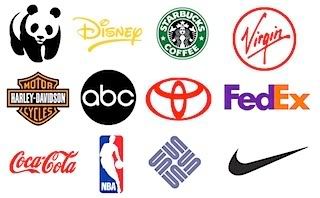
By the way, in case you're thinking that a raster-based, illustrative logo is "superior" to a vector-based logo, it's just not true. Most of the world's top brands and most famous logos were done with simple line work and 1 to 3 colors. This is because, for many decades, the point of a good logo was instant recognition, good readability from a distance and ability to be used with different color schemes. These goals can only be achieved with simple, easily recognizable shapes and hard edges.
A corporate logo had to be legible on the side of ship, boxcar or airplane, on shipping crates and containers and on signs seen from a great distance.
Today, the world of logos is much more lush, elaborate and imaginative. For the most part, this is because logos today are used by individuals and companies where maximum readability is not the overriding concern. That being said, it is still faster and far easier for artists to create "old school" logos in vector-based applications than it is to do the same in raster-based ones.
Glossary
There are many trade terms associated with logos, graphic design, printing and the like. While it is beyond the scope of this site to provide definitions for every term associated with the business, please find the important terms that are directly relevant to the logo creation process.
CMYK: The color model (i.e. way of recreating all the colors in the visible spectrum) that is the universal standard for the physical printing process. This model uses four colors of ink to create all the others. The four colors are: C = Cyan (blue), M = Magenta, Y = Yellow and K = Black. All logos created by King Kreations are built using the CMYK model so that your printer will have no problem.
Comp: A comp, which stands for "comprehensive," is a preliminary piece of art and/or work of art in-progress. In the logo arena, it usually refers to the first Phase (see FAQ below) of the process, in which different approaches to the logo are presented to you. Each of these is a "comp." This term is frequently used interchangeably with "Rough" and "Sketch," though generally speaking a Comp is a more refined version of either of those.
Font: There's a very complicated and technically correct definition for this term I won't go into here. In the common parlance, "font" has come to mean "typeface." So, when somebody talks about "a font" they're talking about the style of type being used.
This should not to be confused with font of wisdom, though King Kreations is that too. Ahem.
Four Color/Four Color Process: The standard printing method used by printers the world over. Four different colors of ink (cyan, magenta, yellow and black) are combined to create most of the visible spectrum viewable by the naked eye. All files delivered by King Kreations are compatible with four color process and ready to be printed.
Identity: In the advertising/marketing world, your identity is the "total package" by which people and clients know your company. It's not just your logo, though the logo is often a significant part. For instance, think of UPS: their "let brown do it for you" slogan, brown vehicles, uniforms and color scheme, and the fun-but-serious tone of their ads is a very strong identity that has little to do with their rather bland logo. Coca-Cola's identity is not just their classic logo, but the red and white color scheme, and their 100+ year history of associating Coke with family and fun. For most entrepreneurs, identity is little more than their logo, but for established companies, identity is often as important to them as their products and customers.
Illustrative Logos: This is a term I use to describe more highly polished and finessed logos, typically those that are taken into Photoshop and heavily "tweaked." Many of the logos on this site with the most "bling" (lighting effects and subtle changes in color and shading) fall into this category. Obviously, those that use actual detailed, fully-rendered (painted) characters and figures are actual illustrations, too.
Illustrator: The vector-based drawing program of choice for most professional artists. For many years a major competitor (also used by King Kreations) was Freehand, but when Adobe (makers of Illustrator) bought out Macromedia (makers of Freehand), the latter (sadly) went away.
Logo: The particular and distinct symbol or graphic used to represent a business.
Pixel: See Resolution.
Resolution: You are probably familiar with the term "resolution" from modern flat-screen TVs. But resolution figures very heavily in the world of printing, too. The image on your computer screen is actually composed of very small squares, called pixels. Similarly, printed material is actually composed of very small dots that are part of what is called the "dot screen." In order to print properly, graphics files must be provided at what is known as 300 DPI (dots per inch). However, your computer monitor shows images at a much lower resolution -- 72 DPI. This is why an image which looks OK on your browser pixelates (degrades) when blown up. It is basically at the "bare minimum" resolution for viewing at 100%.
RGB: In the TV, video and computer world, colors are represented by a blending of Red, Green and Blue, hence the name. While graphic files CAN be created using the RGB spectrum, this is not recommended for a variety of reasons. The most important of these is that RGB represents a "bigger" color spectrum than CMYK. Some RGB colors (particularly very bright ones) cannot be reproduced in CMYK. Therefore, you can go from CMYK to RGB as needed, but not the other way around.
Rough: A very early "take" on an idea. Though a rough can sometimes be very close to the finished design, usually there are many revisions and "tweaks" that take place before the rough turns into a final piece of art. Also see Sketch below.
Round: A period in which one or more designs are being refined. Usually referred to by sequential number. Round 1, Round 2, etc.
Sketch: in the world of logos, a "sketch" is not usually a drawing (though it can be that as well). No, the sketch is simply a preliminary work-up to show others the direction the artist is headed. In your case, a sketch is an early version of a logo, usually seen in Phase One of the King Kreations process.
FAQ (Frequently Asked Questions)
You probably know that "FAQ" stands for Frequently Asked Questions. Well, here's where you can get them answered. If you have questions not answered here, please send an email to ( king_kreations@yahoo.com ).
What Is Your Logo Design Process?
It's really pretty simple. There are two major phases.
Phase One: The preliminary or exploration stage, in which I take your ideas and needs and turn them into "sketches" or "roughs/comps." This is where the "Unique Logo Ideas" mentioned in the packages are generated. To start this Phase, you must pay a 50% deposit, fill out the King Kreations Order Form and provide examples or "scrap" (links are OK) of logos you like to give me a good idea of what you want. At this point, if for some reason I cannot "hit the nail on the head" and you are unhappy with the direction I've gone, then you can pull out.
Phase Two: The refinement stage, in which I take a single idea through to completion. You'll pick the rough you like best and then I'll begin to perfect it, working closely with you. At this point, you'll pay the remaining 50% balance. Of course, I'll integrate your likes and remove or minimize your dislikes to the extent possible. There may be several "rounds" in this Phase as I zero-in on your perfect logo. Once you're content with the finished art, we're done!
How Long Does It Take?
Generally speaking, you'll see your first round of comps in 1-3 business days, depending on my workload. My goal is to complete your logo project within 5 business days, but this depends on the complexity, number of revisions, workload and the amount of time spent in "back and forth."
I tell clients it may take as long as 15 business days from start to finish (longer in the case of illustrative logos). There are several reasons for this. 1) It's part of my process. The best results generally occur when I can step away from your logo for a day or two at a time and come back to it with fresh eyes. 2) There are frequently many factors beyond my control, some of which depend on YOU. Turnaround is the major issue. For instance, if I send you comps to look at on a Tuesday and don't get feedback from you until Friday, then the project has lost 3 days, which will add into the total amount of time spent on the project. This sort of thing does happen, so please remember that part of my progress, particularly in in the second phase, is partially dependent on you.
By the way, when many of my competitors tell you they will complete a logo for you in 2-3 days, bear in mind that they are likely fibbing. In a perfect world and best-possible case it is possible to do this, but let's be realistic. Nobody is just sitting around waiting for your order to come in. When it does come in, the project must be assigned to a busy artist. When the artist gets started, he or she is already juggling many projects, not just yours. And by the way, this last is true for me, too -- but I don't try to bamboozle you about it.
When you take your car into the shop, it's a rare event that your mechanic can drop everything an go right to work on it immediately. Right? Most of the time he's got at least one car ahead of you. Well, the logo business is no different. So when they tell you that you can have your logo in a few days time, be very wary. What they probably mean is a few days time NOT COUNTING delays at their end and yours.
For other major reasons why your killer logo generally cannot be created, start to finish, in a few days time, see below.
Why Can't I Have My Logo In 24 (or 48, or 72) Hours?
Well, you CAN. But that's only in the case of a rush, and only if I can accommodate you. See the section above. The fact is, creating a quality logo requires, in simplest form, two things. 1) Time to research, think and "sketch-out" ideas, and 2) The time to execute them properly.
Not that I am equating logo creation to brain surgery, but if your doctor told you an operation was going to take 10 hours, would you insist he do it in 2 -- even if he could? I mean, would it really be that great of an idea to rush him?
In truth, when you "rush" something like art, you may get lucky and get a good piece out of it. But the odds are, you won't. Really stellar art takes time, even for a professional with years of experience such as myself. Without the "thinking time" and the time to execute properly, your "rush logo" may end up looking just like that. And is that what you really want?
Finally, as in the doctor example above, when you are hiring a professional you are not simply paying for that person's time. The brain surgeon might charge 100K for a 10 hour operation. Do you really believe you're paying him $10,000 per hour? No, in large part you're paying him for his expertise, knowledge and wisdom, which took years of serious hard work, discipline and sacrifice to develop. The same is true in commercial art.
I Need A Rush Logo -- What Do I Do?
First, contact me to see if I'm available to help you in the time frame you have. If I am, we'll discuss costs and other specifics then.
Can I Get A Refund If I Don't Like My Logo?
In a word, NO. Unfortunately, because logo creation is a time-intensive process, there's no way to "get back" the time and therefore the money spent in the development. This is true across the industry, and this is why you should be very sure and comfortable with the artist (or firm) you pick before you start.
That being said, I strive to make my clients very happy... and in my years in the design business, I can't think of a single occasion where a client wasn't. In all that time, it probably has happened once or twice, but I can't think of one. So, with that kind of track record, you can be pretty confident I'll give you what you want and need.
As far as money goes, the process is broken down into two parts. So, you can pull out early and save money if you are unsatisfied. Unlike many other companies out there, I don't charge full price up front. I only charge 50% up front. So, if you're totally unhappy with your comps you won't be out the full amount. With some of the competition, you would be.
I Understand I Pay A 50% Deposit Up Front; When Is The Balance Due?
The balance is due at the beginning of Phase 2 (explained above); no exceptions. This is the refinement phase, also known as the "finish" phase. You'll have picked one of the "Unique Ideas" (Comps) as the model of your final logo, and from there I'll perfect or "finish" it. That is, give it love and make it sing! Shortly after this, your killer logo will be done and I'll deliver the final files to you.
What Do I Get? Do I Own The Logo?
You get the final working files and yes, you own your logo. You may trademark it, copyright it and do with it as you will.
How Are My Files Delivered?
Your files are sent to the email you specify at the time of your order. They are delivered in .jpg, .png and .psd formats, unless otherwise specified.
Do You Backup Your (My) Files?
Yes, I backup files on a triple-redundent system. Should you ever lose your files, I'll be happy to restore them to you for a nominal fee ($25).
Can I Get My Files On CD-ROM?
Yes you can. Get a "hard" backup of your files when you place your order, burned to a CD-ROM ($25). If you wait until I have cleared your files off my drives, then you'll also have to pay the file de-archiving and restoration fee mentioned above.
Why Should I Pay You? I Can Get A Free Logo Elsewhere!
Well, there's nothing stopping you. There are plenty of clip-art and free resources out there, and if that will make you happy, then I'll be the first to tell you "go for it." But the fact is, generally speaking you get what you pay for.
If you don't think you need to pay a professional, then don't. But beware! Just because you think free is fine doesn't mean the end result is actually going to create a good image for you. Over the years, I've seen plenty of "inexpensive" (i.e. bad) logos that actually undermine the credibility and ostensible professionalism of the people using them. Even if you think your logo is "OK," it may be communicating an entirely different message than the one you're trying (or would like) to project. In fact, in today's visually and aesthetically literate society, having a bad logo can send a terrible message.
So, here's some free advice: if you're NOT going to pay a professional, make sure you get some honest feedback from other business people and those who have the experience and expertise to know what you're asking (in other words, don't ask your 6-year old, no matter how good he or she is with crayons).
As an aside, in all of my years of experience I've realized that many people simply do not have the aesthetic (artistic) sensibility to see the difference between a great piece of art and a so-so one. Does this apply to you? I don't know, but if you think a freebee logo is sufficient to the task, you may well be one of these folks.
This, by the way, is why smart companies have at least one good Creative Director on staff to look out for their identity and image. Most "suits" just don't know good art (advertising, marketing, etc.) from bad. So, no offense if this is the case, but you may well be a brilliant business person -- and at the same time a terrible judge of art. It's also true that many entrepreneurs don't understand good marketing principles -- simply because they've never been taught same -- and this can be a real problem when "buying art."
So, the moral of the story is this: if you want a great, unique logo that is personal to you or your company, then you're going to have to A) somehow do it yourself (either with or without clip-art), B) talk your kid or the neighborhood "artist" -- you know, the one down the block with the spraycan in his hand -- into doing it for you (which may not be a good thing), or C) hire a professional.
Personally, I wouldn't trust my car with someone just learning to drive, and I wouldn't trust it on a long drive if it wasn't in the hands of someone competent. Should you trust your company image to anyone other than an experienced, proven professional?
Views: 46
Add a Comment
-
Comment by KING KREATIONS on August 11, 2009 at 3:49pm
-
My wife & I run The King Kreations business. She does all the promotional and management work and i do all the designing.
-
Comment by Diamond on August 11, 2009 at 2:55pm
-
Do you work for a particular company or do all your own work through networking online and charge people who are interested?
-
-
You guys are so far ahead of me that it's not evens funny. But, I do love to learn and play...and since I'm way too old to learn enough to earn anything....I'm just going to enjoy playing:}
-
-
Your welcome Barbara... Thank you for taking the time to read it =0)
-
-
Very informative, thank you for posting it:}
Search
Translate!
Forum
Sharing Thanks to everyone Hugs of Peace and good Health allways. Hippy ... 5 Replies
Started by Hippys Themes in Meeting Place. Last reply by Hippys Themes May 4.
Shiny Happy Random Thread 1601 Replies
Started by AnGella in Meeting Place. Last reply by Jon Blanco Oct 24, 2024.
Untitled
Started by Zohra in Meeting Place Sep 26, 2024.
RIP Skemanon 2009 - 2021 27 Replies
Started by AnGella in Announcements!. Last reply by AnGella Jun 3, 2023.
Apologies for Delayed Moderation 9 Replies
Started by AnGella in Announcements!. Last reply by ღCustom Creationsღ Test Page Apr 21, 2021.
Generators!
SiteModel
Ning Generator
Skinny Ning
Biker Or Not
Create!
Contribute to SA
Find this site helpful? Please consider a donation!
Random Ning Networks
Birthdays
Birthdays Today
Birthdays Tomorrow
© 2025 Created by AnGella.
Powered by
![]()
You need to be a member of Skemaholics Anonymous to add comments!
Join Skemaholics Anonymous