Layouts 4 Ning and more!
New site look!
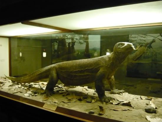
Since no one entered the contest I made the new layout. That's a Komodo Dragon from the Museum of Natural History in Chicago. I took the picture thinking I could use him for something, well now he's our new Mascot!
What do you all think of the new look?
Here is what he looked like before he became our Mascot:
What do you all think of the new look?
Here is what he looked like before he became our Mascot:
Views: 67
Replies are closed for this discussion.
Replies to This Discussion
-
Permalink Reply by Trina on
-
Love the new look, Angella. Colors are great,perfect for this time of year,looks like summer.
-
-
Permalink Reply by Butterflygirlms on
-
LOVE LOVE LOVE THE NEW LOOK & COLORS TOO! FANTASTICO!
-
-
Permalink Reply by Southern Angel on
-
great job.
-
-
Permalink Reply by yese on
-
you come up with some cool designs, but I have to be honest this one is not my favorite. While the color is ok, I'm not feeling the typography and the image of the Komodo(don't like as a mascot). But if its what was chosen I think the dragon should blend more with the bg like softer edges and be smaller. The shadow should be something more like the shadow on the original image of it like more below. I would try to stick w just two fonts but if you use more try to have two similar ones and the one that you want to be the stand out font. I hope you don't get offended because I'm not saying this to be mean just trying to give constructive criticism.
-
-
Permalink Reply by AnGella on
-
Honesty and constructive criticism read and appreciated. There was no way for me to get the drop shadow to do as you suggested so I have removed it. I attempted to soften his edges and made him smaller.
The Dragon became our mascot by default as I had no other lizard images and couldn't think of anything else. I threw this together after finding that no one entered the contest. As for the Fonts, I like them, they follow my rule of threes. But thanks again for your opinion.
yese said:you come up with some cool designs, but I have to be honest this one is not my favorite. While the color is ok, I'm not feeling the typography and the image of the Komodo(don't like as a mascot). But if its what was chosen I think the dragon should blend more with the bg like softer edges and be smaller. The shadow should be something more like the shadow on the original image of it like more below. I would try to stick w just two fonts but if you use more try to have two similar ones and the one that you want to be the stand out font. I hope you don't get offended because I'm not saying this to be mean just trying to give constructive criticism. -
-
-
Not sure, guess it depends on if people want to do that.
W.T Layouts said:will there be a new contest every month or will this be our new look from now on? -
-
-
I don't know why I fill like I'm in a Bob and Ray skit!
I like the new look!
AnGella If you have the Dragon as a separate piece of art,
I can put a nice shadow under it for you.
email me! -
Search
Translate!
Forum
Sharing Thanks to everyone Hugs of Peace and good Health allways. Hippy ... 5 Replies
Started by Hippys Themes in Meeting Place. Last reply by Hippys Themes May 4.
Shiny Happy Random Thread 1601 Replies
Started by AnGella in Meeting Place. Last reply by Jon Blanco Oct 24, 2024.
Untitled
Started by Zohra in Meeting Place Sep 26, 2024.
RIP Skemanon 2009 - 2021 27 Replies
Started by AnGella in Announcements!. Last reply by AnGella Jun 3, 2023.
Apologies for Delayed Moderation 9 Replies
Started by AnGella in Announcements!. Last reply by ღCustom Creationsღ Test Page Apr 21, 2021.
Generators!
SiteModel
Ning Generator
Skinny Ning
Biker Or Not

Create!
Contribute to SA
Find this site helpful? Please consider a donation!
Random Ning Networks
Birthdays
© 2025 Created by AnGella.
Powered by
![]()